Graphic design is strategically using visual and textual elements to convey a message. The aim is to engage the target audience, shaping their perceptions.
Good Icon Graphic Design simplifies communication and enhances the user’s experience on a website. It also shapes users’ emotions, motivating them to take action.
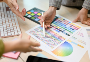
Colour Theory
 Colour can be an incredibly influential graphic design element, evoking emotional responses or conveying information without using words. Unfortunately, it’s also not always easy to master. If you’re struggling with colour selections, gaining more knowledge about colour theory and its guiding principles is essential.
Understanding colour theory can help you select the ideal hues for your design projects and produce more eye-catching visuals. Furthermore, it explains how different hues interact, making choosing your palette more straightforward and intuitive.
The colour wheel is often used to comprehend better how colours interact. This system divides all hues in the spectrum into three main categories – primary, secondary and tertiary.
The colour wheel isn’t the only way to understand how colours interact, but it can be an invaluable aid when practising colour harmony and crafting more visually pleasing compositions. Furthermore, colour psychology and its effect on viewers also play here.
Additionally, the colour theory emphasises the significance of contrast and symmetry in your design. By comprehending these fundamentals, you can craft designs that appeal to viewers and boost your chances of success.
Contrast is the distinction between two colours. High contrast makes it easier to differentiate between them, while low contrast blends them.
Colour harmony is an essential principle of colour theory that all designers strive for. By blending colours harmoniously, you can create designs that are visually pleasing to the eye and easy to read.
Plenty of online resources exist if you want to gain more knowledge about colour science and how it can enhance your design work. However, the key lies in putting this understanding into action. For example, you could take a colour theory course, learn from other designers in your field, or experiment with different colour palettes on your own time.
Typography
Typography is an essential element of Icon Graphic Design. Without it, people won’t even give your project a second glance.
Selecting your designs’ ideal fonts and font sizes can make all the difference. It also helps guarantee that your design flows correctly, connecting all elements.
When creating graphic design Adelaide, typeface and font selection are paramount to its success – whether printed or digital. With thousands of different typefaces and fonts available, selecting the ideal one for your design is critical to its success.
Baseline: This invisible line marks the centre of all text on a page or line and should remain consistent throughout your design. It is the basis for all other typographic elements, such as space between words and letters.
Capital letters stand out more than lowercase ones, so the font used for a brand’s name or slogan tends to be bolder than one suitable for body copy. But that isn’t the only factor to consider when selecting your font; also consider its size – more significant text is more likely to be read first.
Cap Height: The cap height of a capital letter refers to its height from the baseline to the top. Lowercase letters also have similar measurements, though some typefaces have curves extending slightly above and below this limit to appear identical in size.
X-Height: Lowercase letters that appear above and below their cap height, such as g, j, p, q and y; it also applies to lowercase letters without a cap height, like b, c, e and o.
Visual Cues
Visual cues are subtle yet influential graphic design Adelaide elements that guide users through a page or ad. They direct users to the most critical parts of a site or ad and can help boost conversions.
Visual cues can range from a line or arrow pointing to an area on a page to images of people looking at that section. They may also be used to evoke certain feelings on the page or highlight one of many features of a product.
These cues can also help ease the strain on learners’ working memory by decreasing the time spent searching for essential information in complex graphics or diagrams. This extra time spent trying to locate data wastes time that could be put towards other activities.